With film being my primary background I was looking for a way to get introduced to VR but without having to go all in via a game engine. After seeing what Sketchfab was capable of with 3D models I noticed they were allowing animation as well. I reached out to see if they’d be interested in bridging the Sketchfab community with the Artella community to see if we could make a full short VR film.
We were impressed by how receptive the crew was at Sketchfab and they let us in on a little secret they were cooking up; the release of audio into their platform. With the addition of sound, we knew Sketchfab was becoming a full blow platform for VR, and the idea of Artella powering the first WebVR film got us fired up, so we jumped in and joined forces and are excited to share our production journey with you.
A 9 Week Production!
We were tasked to come up with a project and execute it from concept to completion in 9 weeks. For those of you who know how long this stuff can take, that was a tall order.
I’m happy that we delivered and we stayed right within our production plan. There were, of course, some late nights during the last two weeks of production, but we delivered on time and gave a virtual toast in our last team meeting!
Here’s our 9 week production plan which we made in a Google spreadsheet – Yup, this is what we used. Although we finished on time we had to wait for the release of Lily & Snout while Sketchfab finished up their sound integration.
Assembling the Team
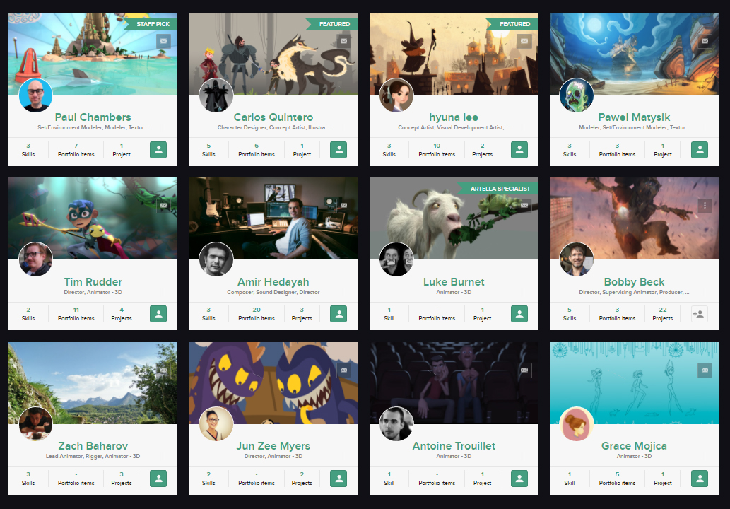
In bridging the two communities we wanted to get artists from both Sketchfab and Artella to collaborate on the production. From Colombia, South Korea, New York, Germany, Poland, Egypt, Paris and New Zealand, we were a total of 12 artists on the production and we managed everything via Artella & Slack and hosted weekly crew meetings via Zoom.
Jun Zee Myers (Zee) – Animator: Lily & Snout was great fun! It was my first time working in VR – I was a bit scared of using VR and ultimately it turned out to be really easy once I learned the basics. The weekly meetings, Artella and Slack were great for keeping the team focused and involved. I wish the production schedule hadn’t been so compressed so that we could have had more time for testing and refining, but deadlines get things done and I’m really proud of the work we were able to do in such a short amount of time!
Assembling a great team is half the battle. We made sure to let everyone know about the time commitment and that the pay was in the honorarium category. Everyone we spoke to was as excited to be on the bleeding edge as we were and we’re really lucky that the crew really pulled their weight and came through – having a tight schedule that we checked in on regularly coupled with our weekly crew meetings and Feed posts really helped keep everything moving.
Pre-Production
Tim Rudder, the director of Lily & Snout, was very open to having people on the team pitch different ideas. We were moving fast so we created a Google doc and captured our ideas there. Check out our doc as it shows the process we used for working quickly through different ideas. Who knows, maybe you’d like to develop one of the other ideas we had?
One of our ideas was about a dragon and a little girl interacting with each other and we decided to pick that idea and develop it further.
Along with each idea we’d put an image or two to capture the essence of what we were going for (see above doc for more examples). I added an image of a dragon sleeping in a beautiful forest and came up with a simple concept around it. This image was done by Artella member, Hyuna Lee (see below). I’ve been a giant fan of Hyuna’s work since I first saw it on Artella. Her visual style truly inspires my imagination and whole stories seem to unfold just looking at it. I reached out to her and she agreed to join the crew and we were off to a great start!
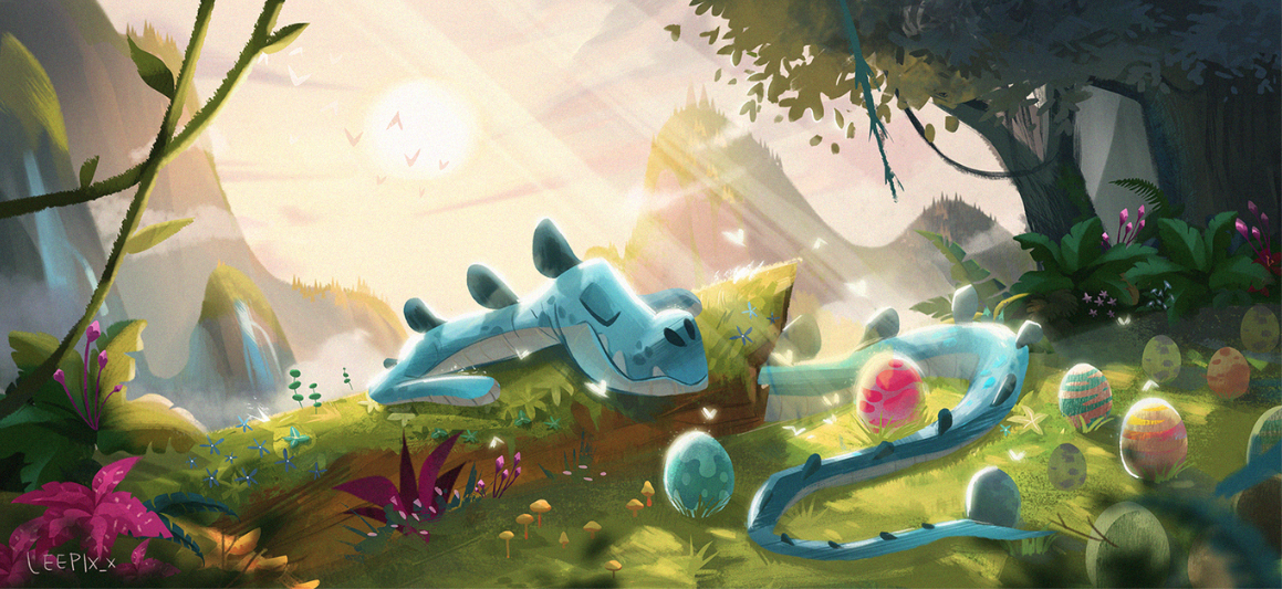
Original image that inspried Lily & Snout
Story Development – Previs
Tim and I created a doc where we worked to refine the script through text. That served as the basis for what we’d give to the animators to start working out previs.
Because we were tight on time we decided to work in previs to flesh out the story vs doing boards or experimenting with new methods. Tim created two proxy characters that were built to scale – see below.
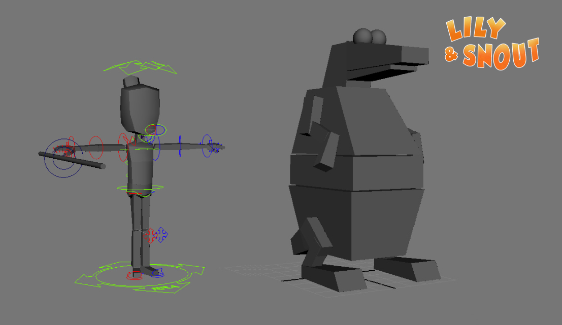
A very rough set was built and each animator got their own version of the previs file in Artella. Tim, Zee and Luke would come up with their own ideas and post them to the Project Feed for input.
I’d take those playblasts from the Feed and bring them into Premiere and stitch different parts to make something cohesive so we could watch it and see how it was playing.
At this point our story development process didn’t have much to do with VR yet. We were working rough and fast so we could focus on the relationship of these two characters. The only thing we asked the animators to do was to keep in mind that their previs should mimic a 360 VR experience. They’d animate the camera but it would try to mimic movements they thought the audience might be doing.
Tim: At first we were interested in the possibilities VR offers, surrounding the viewer and feeling more at one with the world by controlling their view. My first pass on previs tried to push this aspect, but we found it was quite a hard user experience to follow so much action. We decided to reduce the amount of looking around a viewer needed to do, but also decided to keep them to one spot as a default for browser users. It made the viewing experience much easier by having only rotations on the camera, instead of having translations too.
Zee: The main difference in VR is the camera. As the viewer, you are the camera. In film, the filmmaker creates the composition of the shot, but in VR, that role is reversed. My favorite thing about VR is being able to look where I want, but as an animator you cannot animate to camera in the same way you would in a standard production. Also, by the viewer being the camera, this removes editing and cuts entirely, at least in a traditional sense. The animation must pull and guide the eye to relevant story points, without the aid of cuts. Initially I thought all characters must be animated at all times, even if they are not the focus at any given point, because the viewer can choose to look towards those characters. But by having our characters hidden from view at times (like the dragon in his dark cave), we were able to cut down on extra animation. In general though, VR does require more animation!
Previs by Tim Rudder
Visual Development and Character Design
Hyuna did some of the most inspiring visual development all the way from day one through to the end of the project. Although she only attended meetings with cam off and communicated through the Artella Feed and Slack due to her comfort level speaking English, she was a giant part of the team and was constantly blowing our minds with great ideas.
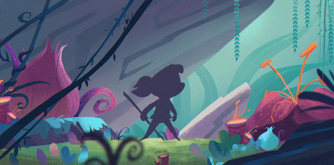
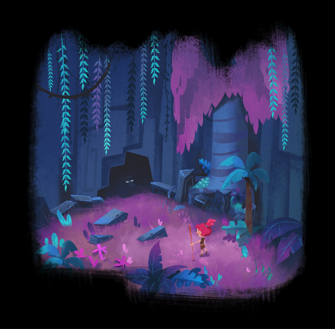
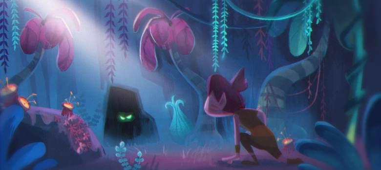
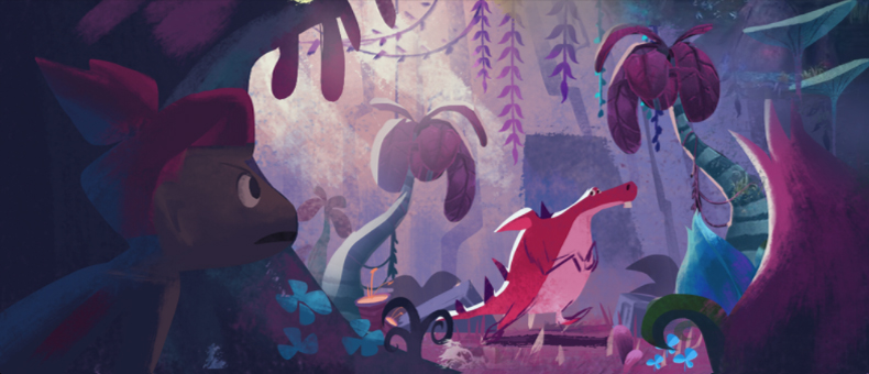
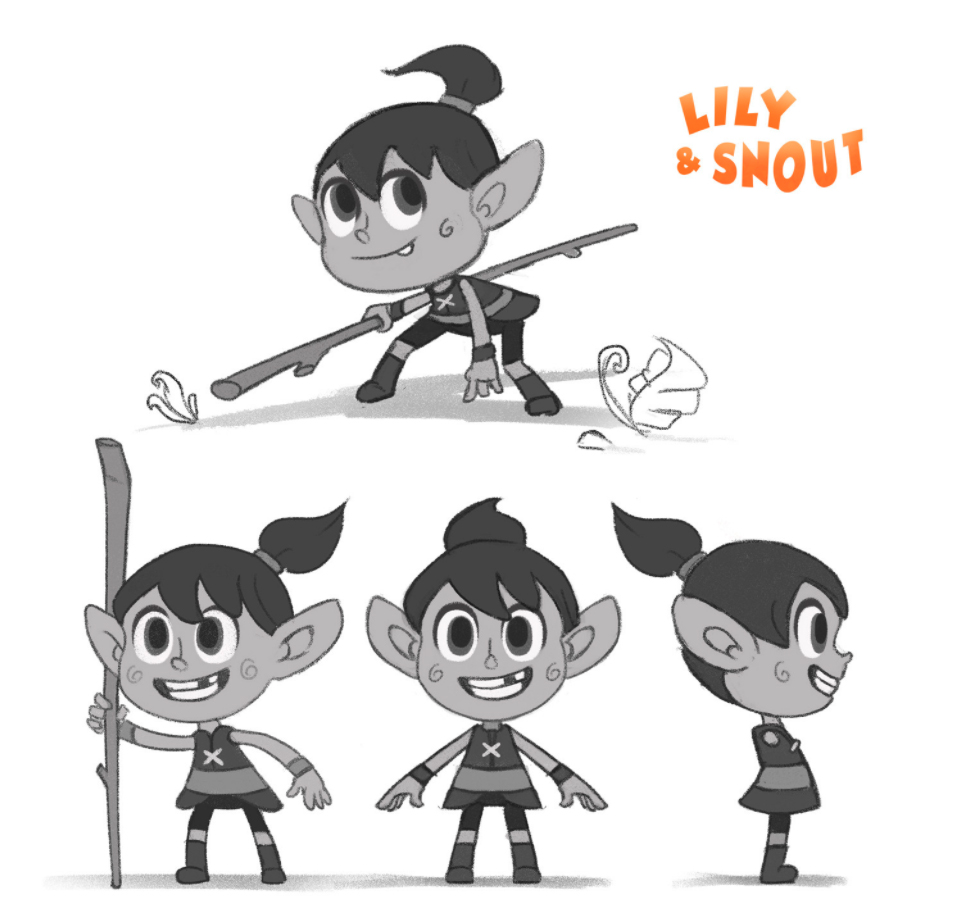
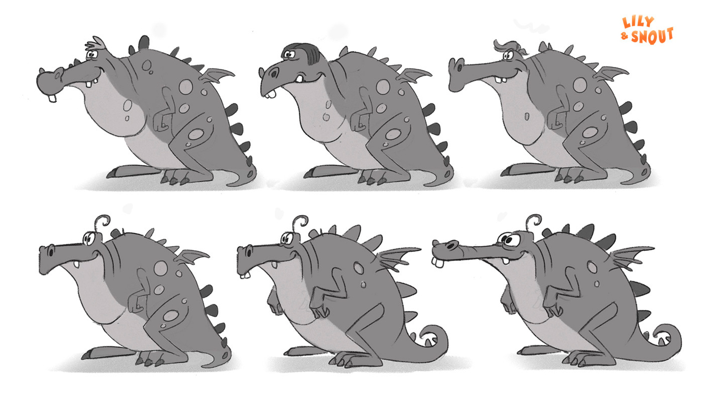
Character design was done by the fabulous Carlos Quintero who came to us via Sketchfab. He nailed the designs early on and did many iterations with different colors so Tim could find the right balance.
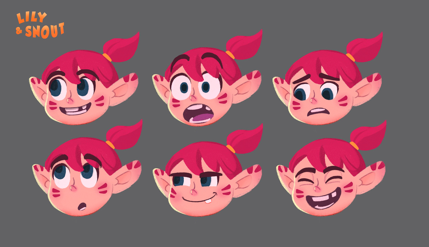
Asset Development & R&D
Character models and surfacing were done by Carlos who really nailed his 2D concept art perfectly.
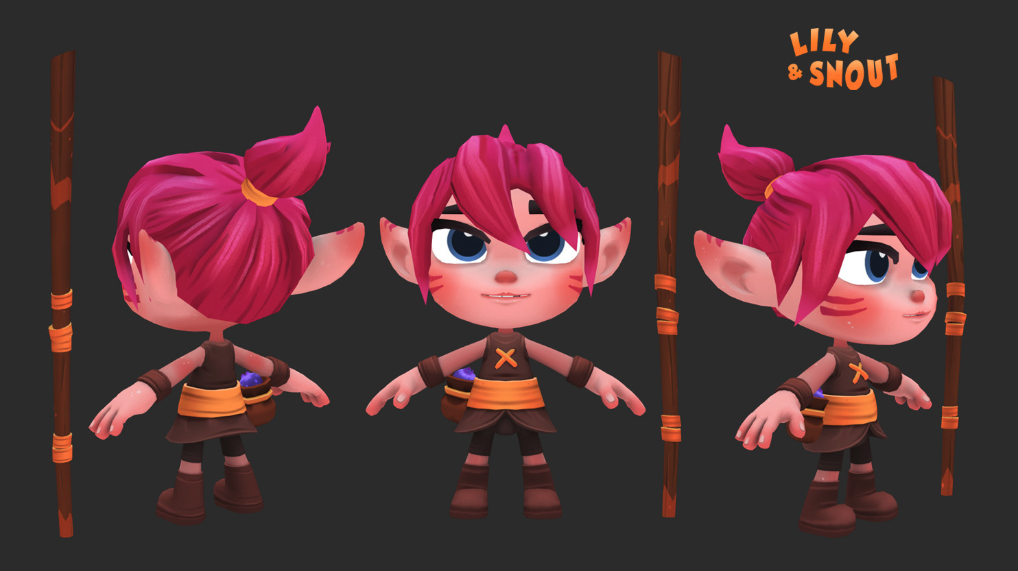
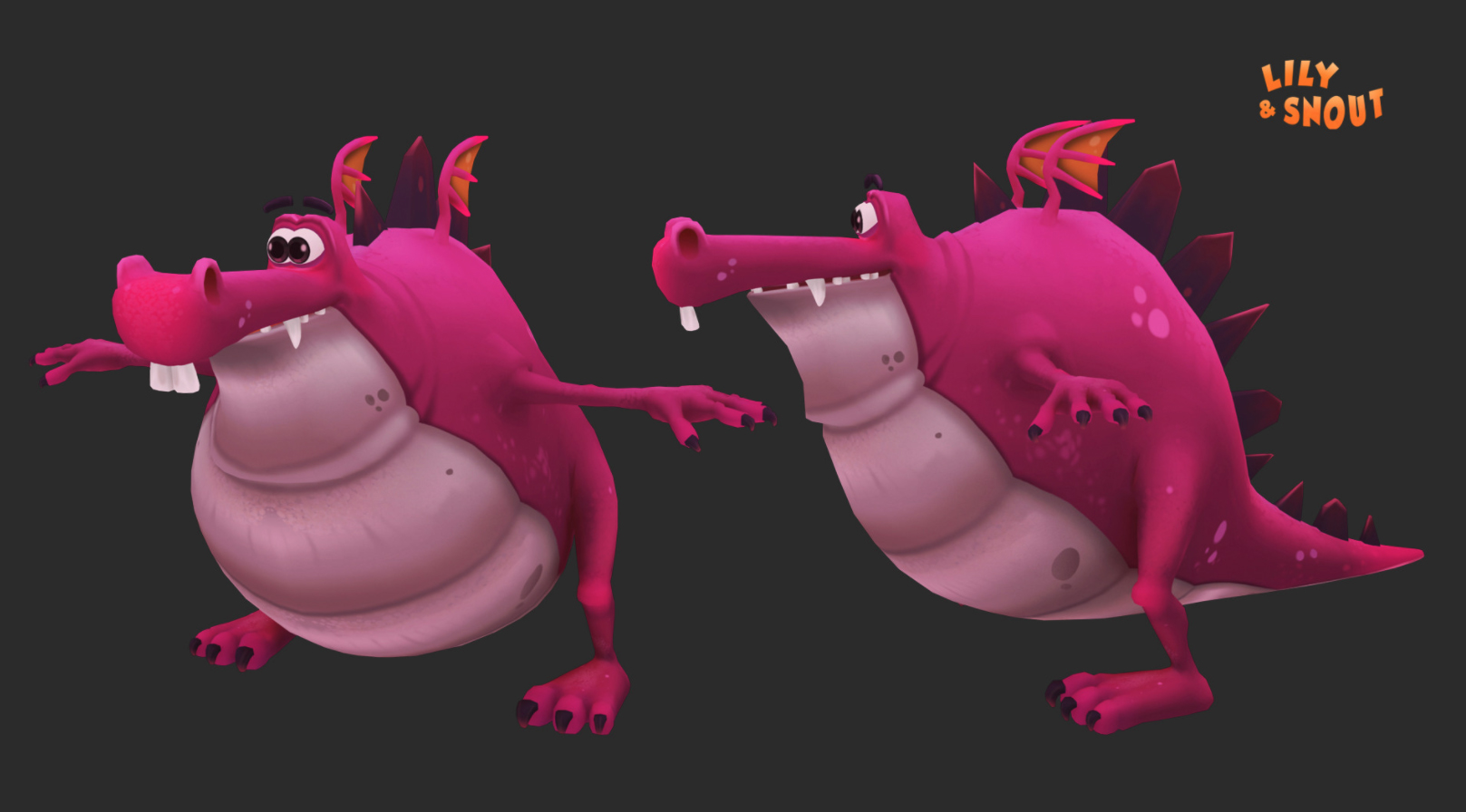
We decided to keep the lids very simple by using geometry vs blend shapes (read more below in the rigging section). We weren’t sure if it was going to work, but it wound up being an old school cheat that really worked.
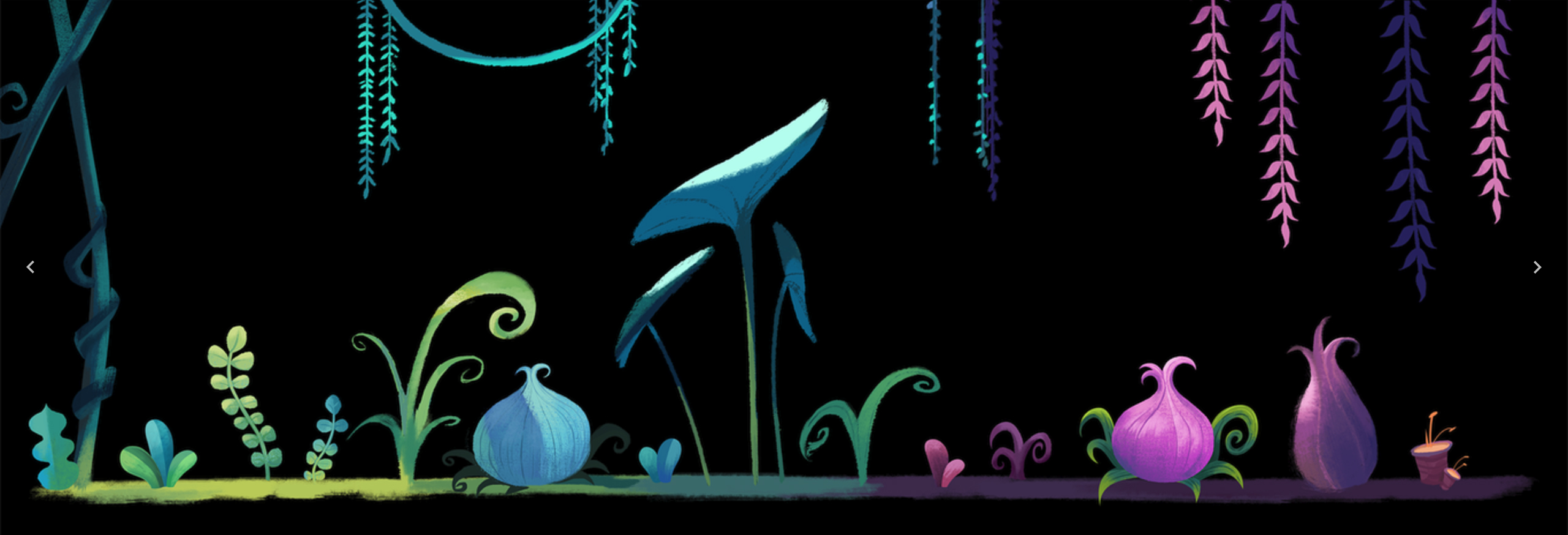
The environment modeling and surfacing work was done by the incredibly talented Pawel Matysik who also came to us via the Sketchfab community. We saw his work on his Sketchfab work and were dying to get to work with him. We were SO thrilled when he agreed to come on board.
Very early on Pawel took some of Hyuna’s concept art and did a 3D rendition of it in Sketchfab and that’s when we knew this piece was going to be something special – see below.
Grace Mojica was our resident R&D guru. Being fluent with sketchfab she was able to help guide us along the way so we made good choices to optimize the character rigs (next section) so that the final result would play at real time with no hiccups. Grace later came on to animate a section of the piece and did an outstanding job!
Grace: I had never uploaded a big, long animated file to sketchfab, so we had to test long animations, big hi poly files, we didn’t know for sure what options were available like morphers/blend shapes, squash and stretch, visibility, etc. So we did some quick tests at the start of the project to answer some questions and to check how things would affect performance etc.
Rigging – optimizing for Sketchfab
The end result from software to Sketchfab means having the entire scene needs to be exported to an FBX file. Seeing Sketchfab then plays that file in real time, had certain limitations we needed to learn and stick to.
Artella member and rigger on Lily & Snout, Zach Baharov, works in games and was already familiar with a lot of the limitations we might encounter. His experience proved to be critical to the success of the project and he’s kind enough to share his tips with you below.
Bone limit, blend shapes, things to avoid when exporting to cache for Sketchfab:
Zach: When I was first coming onto the team there were some tests being done on exporting a geometry cache, which is a snapshot of a character’s mesh per frame, into Sketchfab. As expected, this turned out to cause huge file sizes not feasible for online streaming as well as playback in a real-time rendering setting.
Having had a lot of experience both rigging and animating for video games, I knew that to hit our performance targets on a variety of devices, ranging from smartphones to VR headsets, we would likely need to forget about deformers (like blend shapes) and stick to a joint-only rig setup for our characters.
Before starting each rig, I made a spreadsheet proposing three levels of each characters, describing the bare minimum, acceptable, and ideal number of joints each character would have. Then I worked to adapt the proposed optimized version of the skeleton to include what Tim felt were the most important articulation points for each character.
Cheating squash and stretch for the animators:
Zach: Even from the beginning, the highly-stylized nature of our two characters suggested that they needed to support squash and stretch in their animation. I made some modifications to my rigging tools to unlock the scale attributes on all controls, and free up the animators to deform each body part as they wished. Through non-uniform scaling of the joints and separate pieces of geometry, we were able to achieve a satisfying amount of squash and stretch as seen in smear frames all over the final piece.
Zee: Barely felt like a cheat! Zach did a great job. There’s a lot of stretching going on in Lily & Snout and it works really well. Squashing was a little more difficult as we didn’t have room in the rigs for blend shapes or other compensation for volume loss, but I was amazed by what we could do considering the limitations.
Animation test by Bobby Beck
Animation
We assembled an incredible crew of animators via Artella; Tim Rudder, Jun Zee Myers, Luke Burnet, Antoine Trouillet and Grace Mojica. Everyone worked through Artella and submitted their work to the project Feed for reviews.
Tim: For most of the animation process we worked in a traditional way of animating a camera in Maya that we thought would simulate the user’s experience, then for the most part playblasting that out and stitching them all together in Premiere to make an “edit”. The edit worked well as we could get sound design moving while still doing animation touch ups, just being careful not to change timing or making note of it when we did. Encouraging animators to view their work more often in Sketchfab would’ve saved us time in the final stages as there were a few places animation needed more work or refining that we couldn’t see in playblasts.
To have multiple animators working on essentially one shot, we set up an original master file with a few key poses based off the previs. We then split that up into smaller sections for each individual animator to work on. When stitching back together we baked out animation on IK joints and the COG to locators, deleted any keys and values on the layout nodes of the rigs and then reapplied the animation from the locators back to the rigs. We did all this using using CG Monks Locinator Tool, and were able to make the cuts between animators seamless.
Animation blocking by Antoine Trouillet
Look development
One of the things we were pleasantly surprised with is that lighting happens in real-time. There’s not a lot of control in this area on Sketchfab just yet so the result is you get a lot for free and fast. Good thing is we found this out early in our R&D work and pushed the visual style to accommodate for the more colorful look you see in Hyuna’s art and in the final piece.
Zee: Production-wise, it’s pretty amazing to not have lighting, rendering or comp. I was so impressed with Hyuna, Pawel and Carlos. They really brought the world to life. In the future we will be able to handle more and then it will be interesting to see how lighting comes back into the mix as it is a powerful storytelling tool.
Exporting and Importing into Sketchfab
When it came time to stitching everyone’s files together Tim took the lead. Because the files were in Artella he was able to grab them easily.
The stitching was done in one file and then exported to FBX out of Maya. Tim would upload the FBX file via his personal Sketchfab account.
You can embed Sketchfab posts directly into Artella, which we did for feedback, however when it came time to bring things together for the final assembly Tim shared his login and password with us so we could access and edit the settings directly in Sketchfab.
Pawel went in and applied the textures and filters. We noticed small issues such as geometry not matching up in certain places and other things we wanted to add later such as the waterfalls which were handled via animating three pieces of geometry that scaled as they dropped and then we looped those piece of geometry to get the waterfall effect. Thanks to Pawel for that idea!
The exporting process happened many times towards the end as once a file is uploaded into Sketchfab you can’t apply anything to another file such as camera positions, filters, textures, etc. You have to redo that each time.
Camera tip for Sketchfab
Cameras are a bit tricky in Sketchfab and Paul Chambers was great at giving us a superuser trick that we want to pass onto you.
- To load lose the zoom in effect upon scene load, append this snippet to the end of any Sketchfab URL before embedding it:
- ?&camera=0
Score and Sound Design
For our composer and sound designer we were fortunate enough to have Amir Hedayah join the crew. Tim and I worked with Amir on another Artella project, DUEL. He’s such a joy to work with as he listens well to what you want and then blows you away with something beyond what you could have ever hoped for.
On film productions it is preferable to have the final edit locked before the score and sound design begin as it’s a lot of work when things shift even a few frames. On this project we thought we could block in the score and sound design then refine it, but we found that it was creating a lot of extra work so we opted to go back to the traditional style and have Amir come on once the edit was locked in Premiere, then he started working with that.
Amir created three tracks for Lily & Snout, 1) Score and ambient sounds 2) Snouts audio (which was done by Amir himself) and 3) Lily’s audio. This allowed us to assign the character’s audio separately inside of the Sketchfab editor so that the sound would get closer and farther depending on where you and the character was at in the scene.
We were about two days to completion and Amir had an audio session booked with a local girl from Egypt, where he was living at the time of our production. The poor girl got sick and was not able to do the session. At that point we had to scramble so I asked my daughter, Delilah Beck – 5 years old, if she would do the audio. I showed her a video of how they did the voices in Moana and she got really excited. She was nervous but after we got started she really got into it. After our session I sent the audio files to Amir and he worked his magic.
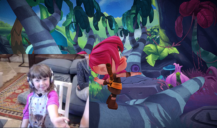
Delilah Beck in her recording session for Lily’s voice
Social Media & Promotion
We kept a week-by-week breakdown via our Artella Project Overview. Each week we’d post that update to Artella’s social media channels. Sketchfab was great in reposting these as well. This led to building an audience in advance of the project’s release.
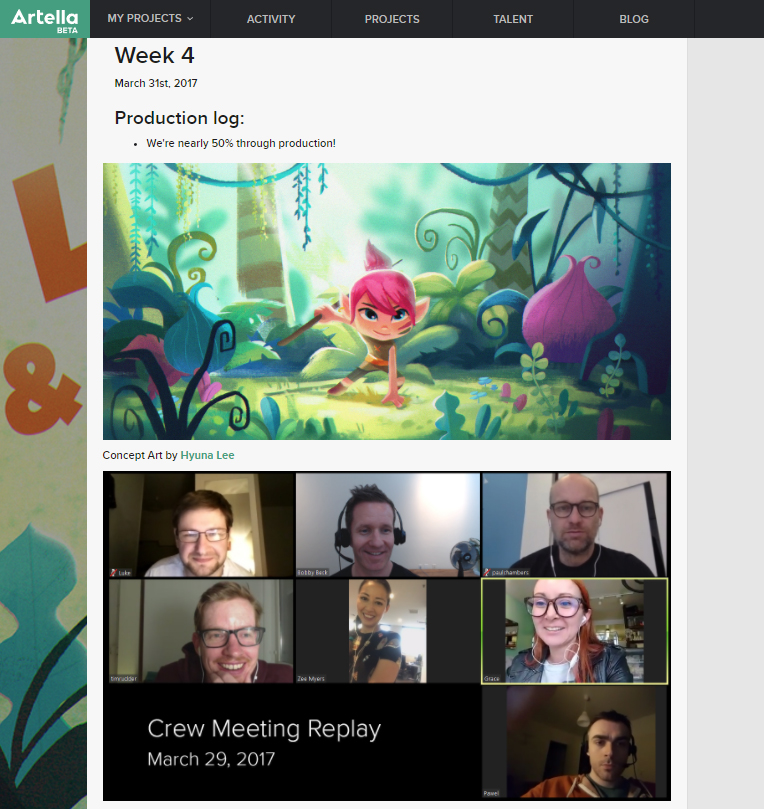
I missed a post one week by a day and got several direct messages on Twitter and Artella asking when the next update was coming. That’s when I knew it was working 🙂
Promotion as you go is something that projects should think about as in this world of oversaturation of content, people may miss your project if you just post it up the day it’s done. So we encourage you to post behind the scenes info as the project develops to generate a fan base that will help you promote the project when it comes out!
We didn’t share anything about Snout (The Dragon) until the project launched. That was our Easter egg that we wanted to keep as a surprise. Surprise! 🙂


Thank you for sharing the process of working through this new frontier of VR in short film making. The thing that stuck with me is how you tied the audience to a single spot to view the action via rotation. This was smart from a storytelling perspective. You’ve allowed some access to the VR world, but also create some focus on the action at hand. Allowing the audience to see the flow of the story as it progresses.
It will be interesting to see how longer films will be produced. Having more sets to travel to and working through a more complicated story line. You could have a Directors and VR cut of a film. Exciting things to ponder!
Thanks again,
Joe